My Travels with Tintin – Korea
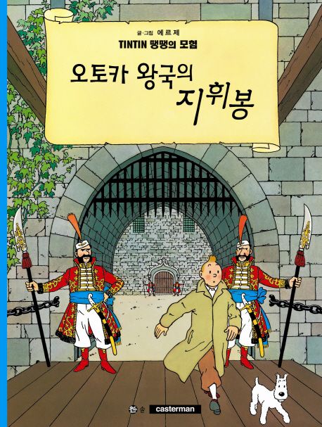
I have one Tintin album in Korean, “오토카 왕국의 지휘봉” (King Ottokar’s Sceptre). My album, originally translated by Ryu Jin-Hyun, is a hardcover edition published in 2003 by Sol Publishing House.
Tintin has an interesting publishing history in Korea. It was first introduced by the Wooil Culture Company (우일문화사) – also known as ‘Universal Publication Agency” in English – in two albums published in 1977. The first was “피라미드의 비밀” (Cigars of the Pharaoh), although inexplicably translated as “The Secret of the Pyramids”, and the second was “푸른 연꽃” (The Blue Lotus). There’s some debate as to whether or not these were licensed editions. Based on the general production quality, the assumption is that they were legitimate. However, given how poorly one of the titles were translated… I believe that’s a loose assumption at best.
In 1978 a series titled “The Adventures of Tintin” was serialized in a few issues of the magazine “소년중앙” (Boy’s Central) before fading away. Strangely enough Hergé wasn’t even credited as the author. Instead it was credited to a fictious author named “Seon Woo-Chul” – which strongly suggests it was a pirate edition. In 1982 Tintin was also briefly serialized in another magazine, “보물섬” (Treasure Island), which was published by the Yook Young Foundation – likely because the chair of the foundation was none other than the “first daughter” (and later disgraced President) of Korea, Park Geun-Hye.
Interesting to note that around the same time, from about 1983 to 1988, the Yanbian People’s Publishing House, in Jilin Province, China published several albums (The Black Island, The Land of Black Gold, The Secret of the Unicorn, Red Rackham’s Treasure, Flight 714 to Sydney, and The Shooting Star) in Korean… albeit pirate editions intended for a North Korean audience.
In 1992, Cosmos Publishing published three Korean language editions (The Shooting Star, Explorers on the Moon, and Tintin in Tibet). Translated by Lee Seung-hyung, they quickly went out of print. However, the series wasn’t properly published until 2002, when Sol Publishing (in cooperation with Casterman) released the first complete and official Korean language editions, translated by Ryu Jin-hyeon and Lee Yeong-mok. A revised edition was published in November 2011 to coincide with the film’s release and a second revised edition followed in May 2016.
As for how I got my album… I was a bit picky. The newer Sol editions are arguably nicer (better fonts and thicker paper) but there were two reasons I took my time to find a 2003 Sol edition. The first is simply because I had the time. Unlike most of my foreign language edition hunts – where I’m only on the ground for a few days at best and I either find it in the wild, navigate some a website in a language I don’t understand, or make a local friend… living in Korea (and speaking/reading the language) gave me the opportunity to be picky. I was also a bit picky because I didn’t like that the newer editions were smaller than what I generally consider the “standard” (and appropriate) Tintin album size. The new editions are only 190 * 255mm softcovers… and I was holding out for a 233 * 310 mm hardcover – which I finally got my hands on on a shelf at the Aladin second-hand bookstore in Chongno in Seoul. There were a few options at hand, but I chose “오토카 왕의 지팡이” (King Ottokar’s Sceptre) mainly because… at that point I didn’t have it in any other language (although I now have another edition in Polish).
My trips to Korea:
I’ve literally been to Korea more times than I can count.
My first time to visit Korea was in 1995. In an era long before anyone had even the faintest idea of “K-Pop” (or “K-Drama”) I spent two semesters as an exchange student at Yonsei University in Seoul learning the language and culture. In 2000 I lived and worked in Chuncheon for a year. I also lived and worked in Seoul from 2013 to 2020… and have been back to visit almost once every year or so ever since the first time I set foot in the country. It really is my second home.
That makes it hard to narrow down my Korean experiences to just a couple of memorable trips. So, unlike most of the other posts in the “My Travels with Tintin” section of my blog, this time I’m going to talk about the time Tintin came to visit me!
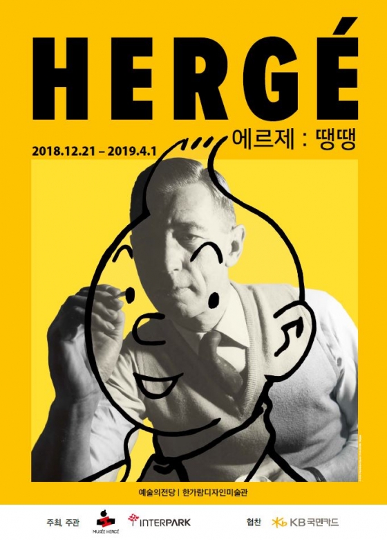 From December 21, 2018 to April 3, 2019, the “Hergé: Tintin” exhibition was held at the Hangaram Design Museum in the Seoul Arts Center to commemorate the 90th anniversary of the birth of Tintin.
I was proud (and a bit surprised) that Seoul was chosen as the location for the first large-scale retrospective in Asia, and the exhibition “Hergé: Tintin” certainly was large. The Seoul exhibition consisted of a total of 477 works, and included original drawings, paintings, photographs, videos… and scale models! It was divided into 10 exhibition spaces based on Hergé’s chronology and themes related to Tintin’s travel destinations.
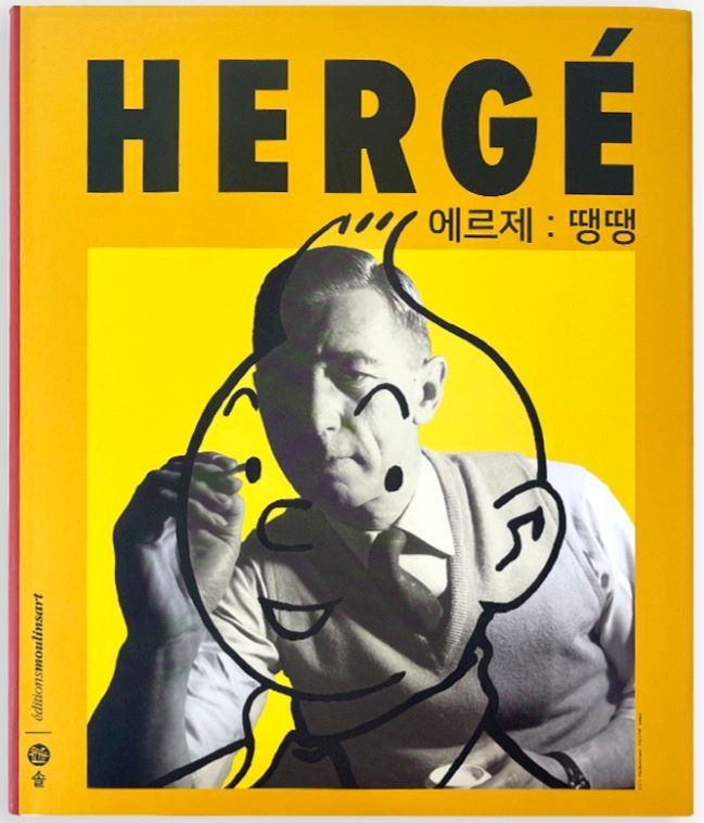
Strangely enough, I first heard about the exhibit when I saw one of the amazing (and bright yellow) “Hergé drawing Tintin” posters that began appearing around town. In my first-ever brazen act of thievery, I carefully removed one from a bus shelter and it now hangs proudly on the wall of my model-building room. I didn’t feel too bad though, because there were about 500 other copies of the poster all over the place and they were all destined to be ripped down in a few days and thrown in the garbage (or recycling I hope!).
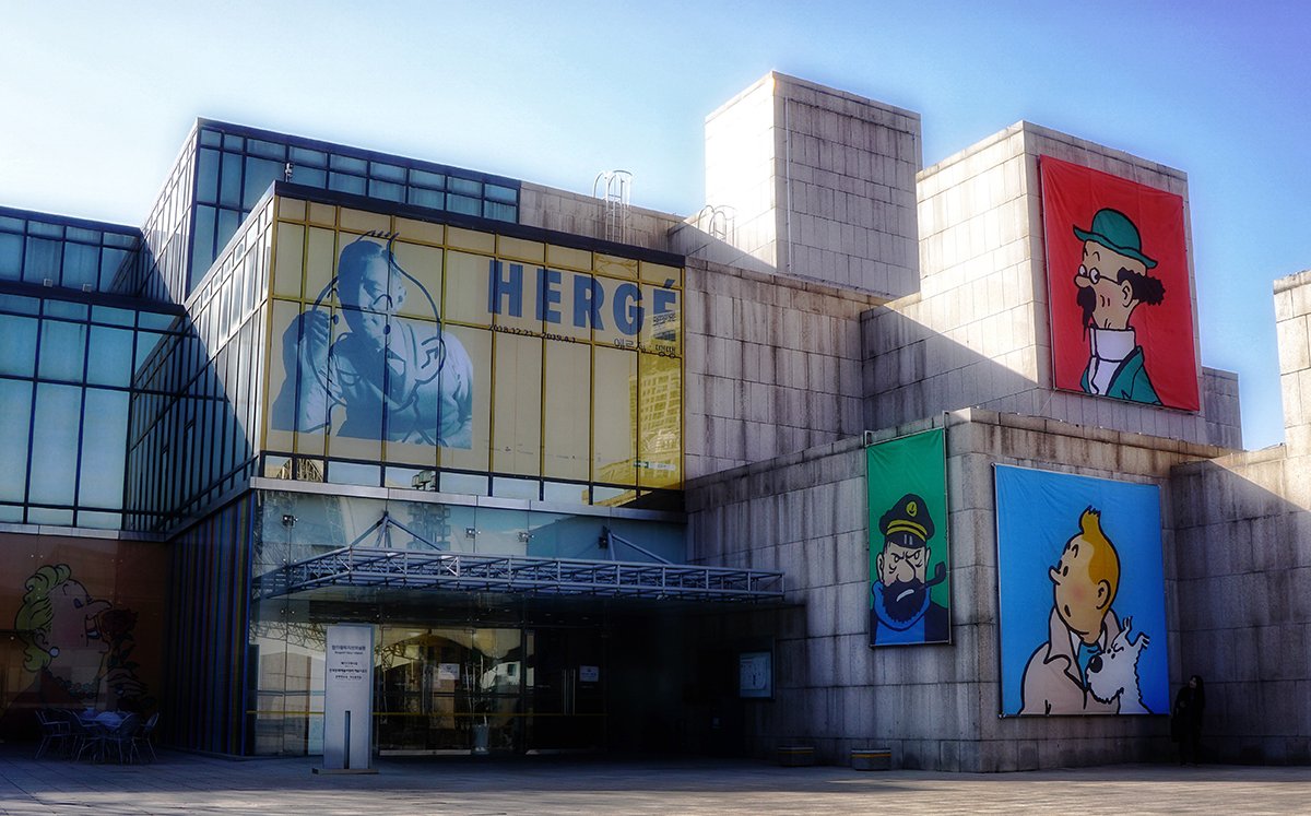
Conveniently the exhibition opened just before Christmas 2018 and was a perfect item to add to our “Christmas break itinerary”. So on December 26, 2018, my wife, my son, and I headed out on a day trip to check it out. It was a bit of a trek; Seoul is a large city and the Seoul Arts Center was a fair way across the river from our apartment. I think the fact that it was a bit of a day trip just added to the excitement though. I knew we’d arrived as soon as we got there though, as the facade of the building was covered in huge silk-screen prints of Tintin and friends.
I have to admit, I wasn’t quite sure what the plan behind the actual layout of the exhibit was… it seemed a bit non sequitur. Immediately after entering, the first thing you get to see are some of Hergé’s paintings. As most Tintin fans know, Hergé might’ve been an eager modern artist, but was squarely in the “don’t quit your day job” in terms of execution, so it seems odd as a starting place to celebrate his life’s work.
Just as strange, the next room features the famous Andy Warhol painting of Hergé – which is fair enough – but the showcase is framed pages from Alph-Art that spell out the word “HERGÉ”. I was actually a bit worried that we had somehow started at the wrong end and were going backwards… but no, it was pretty clearly moving in only one direction. I’ve never been that interested in Alph-Art, mainly because it’s a) it has even less semi-finished artwork than Tintin and the Thermozero, and b) I feel like Hergé was just going through the motions by that time and if Tintin and the Picaros is any gauge of the trajectory it would’ve followed, I doubt it would’ve been of the same quality as his previous work. Still, having several framed original pages spelling out his name was a nice touch. I’ve since heard that some of the pages on display (specifically in the “E”) were unpublished, but that’s unconfirmed and generally seems odd though – why would they have held back any pages from the official publication? The room also featured a couple of display cases showing colour plates from the Broken Ear and a copy of the Arumbaya Fetish. Again, an odd juxtaposition of the Warhol painting, his unfinished final album, and a totally unrelated early work.
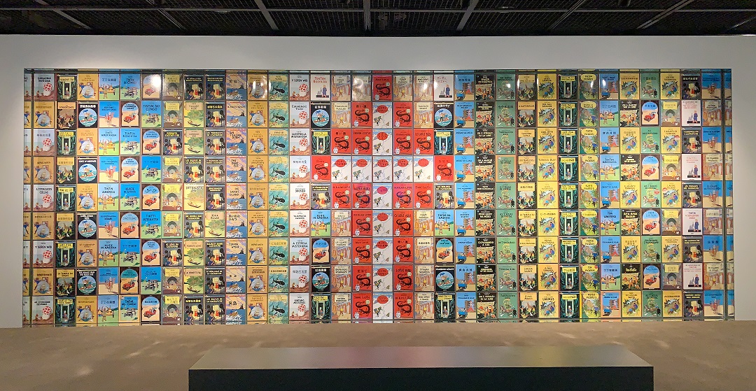
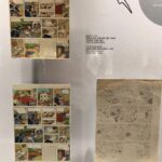
The next room really caught my attention though. First was the “wall of foreign language covers”. As someone who has a hobby of collecting foreign language editions of Tintin albums from countries I visit… this was inspiring. It’s one thing to know that the Tintin albums have been translated into more than 100 languages, it’s another to see them laid out in front of you. My son and I spent a good long time trying to figure out exactly which languages were represented. Amazing.
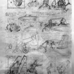
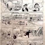
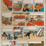
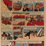
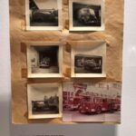
I was also taken by the display that showed the progression of how the albums were created. Several of the reference images from Hergé’s files were on display. He was famously meticulous about using references, and it shows in the finished product. I particularly liked the scene from Tintin in Tibet where Captain Haddock is racing to make his flight. You can really see the tightening up of the artwork provided by the “ligne claire” inking style. I was also quite surprised to see that the colour plates were done completely independently of of the black line art. The original colours are also so much more vibrant and clean when compared to what actually gets printed on the final page.
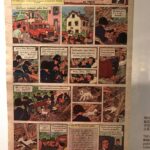
The following room was devoted to The Shooting Star – including a larger scale model of the observatory! I hadn’t really thought to include that amongst my Tintin projects… but let’s say it’s given me a bit of inspiration. There are several “major” projects on my list (mostly ships) that would be ranked higher on my priority list, but it just proved to me that I won’t run out of ideas for Tintin-related models any time soon. Besides the model, there were also a lot of pages from the stories that appeared in Le Soir.
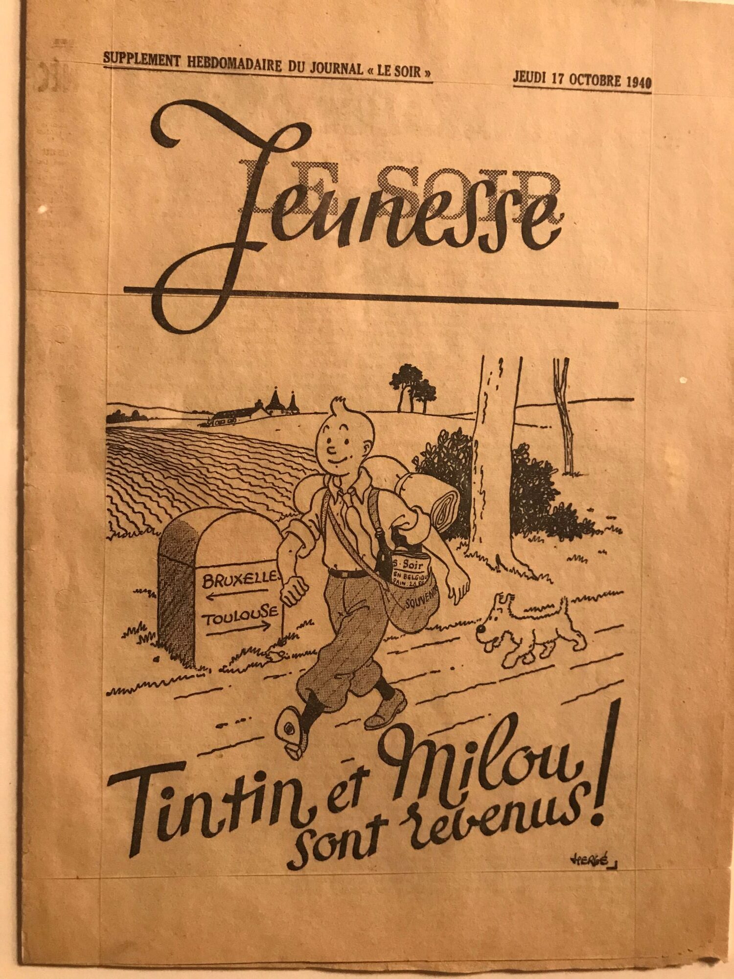
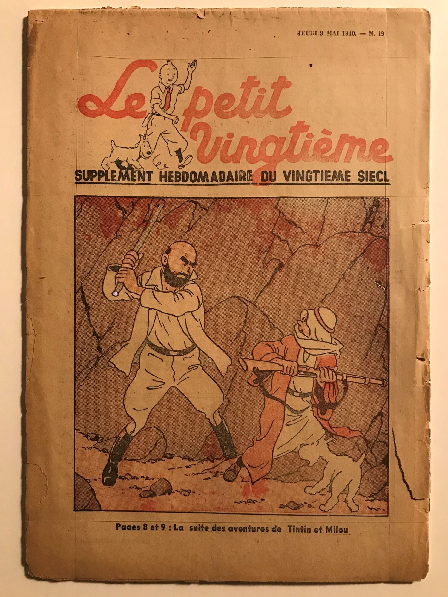
One thing I found interesting was seeing the original copy of the final le petit vingtième supplement from May 9, 1940 – the issue that ends on a cliffhanger from The Land of Black Gold, with Dr. Müller knocks Tintin out, ties him up and leaves him to be buried by the approaching storm. Then I got to see the first issue of LE SOIR Jeunesse, from October 11, 1940 – with the triumphant return of Tintin and Snowy after their 5 month hiatus… albeit at the start of a brand new adventure, The Crab with the Golden Claws. Given how flimsy these newspaper supplements were, and the generally low print and production quality, I’m surprised to see any of them survived the war years in Europe. Hergé’s original artwork and files were one thing – but you’d expect something that important to survive under the direction of the artist and his studio. But despite there being many more copies of the supplements printed, given their transient nature as largely disposable entertainment… well, somehow being able to see a copy in real life left me in awe.
The next room was the “How a comic book is born” room. A bit of an introduction to Hergé’s studio and an overview of the creation process from the inception and the reference pictures right through to the pencil roughs, the final inks, the colour plates… and the printed page. I’ve heard about how meticulous Hergé was in his process, but it was still eye-opening to see it all laid out before you in such detail. Once again, the colour plates were the most intriguing – seeing the artwork without the black lines gave it a surreal characteristic.
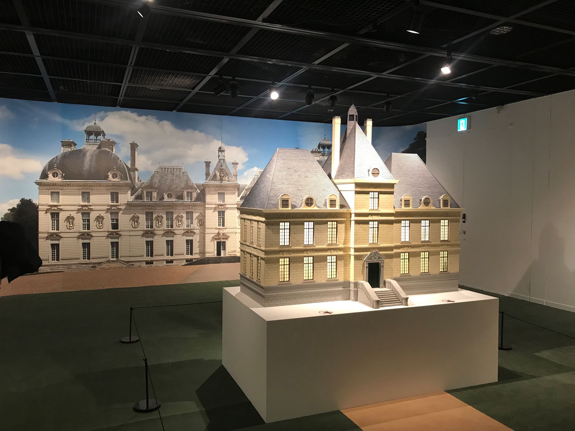
After that came the room that fascinated me… albeit mostly as a model builder was one that featured a large scale representation of Marlinspike Hall itself. Since this is one of the “major” Tintin model projects I have (along with the Lunar Rocket and the Unicorn ship) planned, I took several photos from different angles to try to capture all the details that will be important once I start my project.
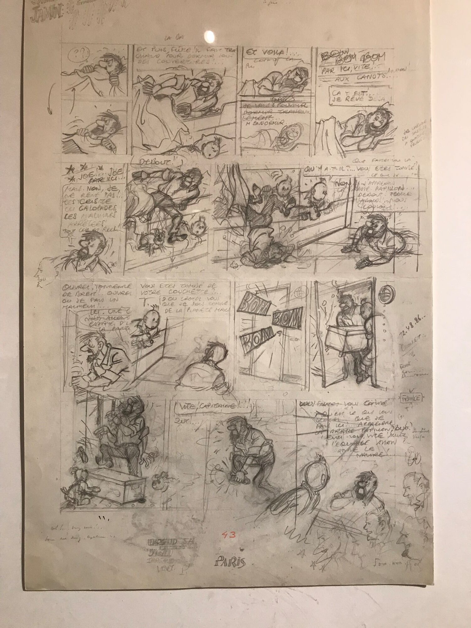
The exhibit in this room also featured several of Hergé’s rough pencil drawings. One that stood out was a page from The Red Sea Sharks – the one with the “falling out of a bunk bed” and a “dropping a heavy trunk on a foot” gags. What’s really interesting about it though is the word “Jamin” written several times in the margin. Hergé had worked with a man name Paul Jamin at “Le Petit Vingtième” – a man who, after the Liberation, was condemned to death (and later released) for pro-Nazi illustrations and anti-Semitic caricatures published as a collaborator with “Le Soir volé.”
Even though I didn’t manage to capture it (I was more interested in the sketch than the margins), next to the name “Jamin” is also the mysterious word “commissioner” – leading some to believe Hergé might have been questioned by the police about his former colleague? I guess there still are a few Hergé mysteries.
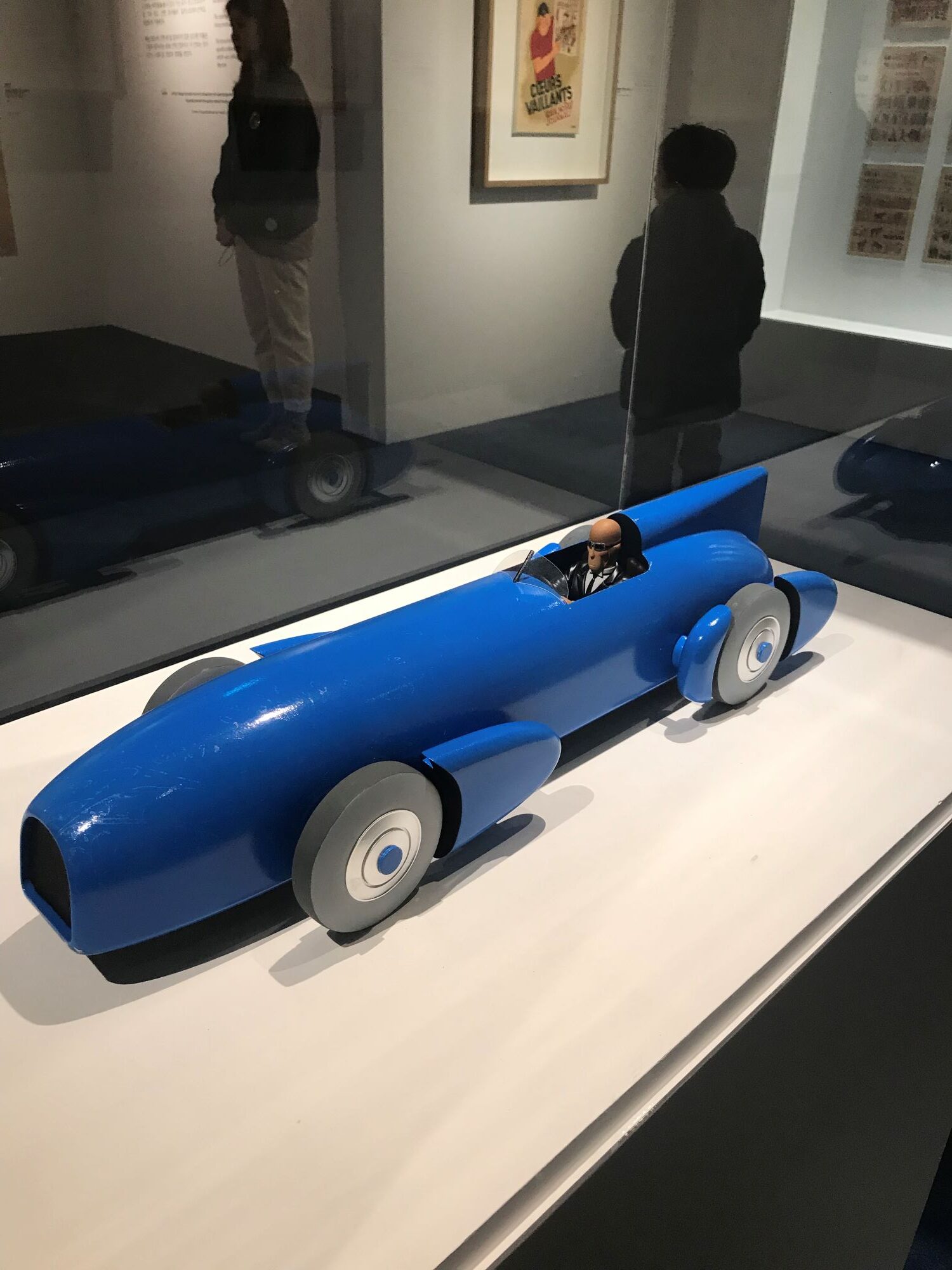
After that, the following room was dedicated to one of Hergé lesser-known works – “The Adventures of Jo, Zette and Jocko”. One of the walls was covered in 40 issues of Couers Valliants – the French publication in which the adventures were serialized. The exhibit also displayed an alternate cover for the album The Manitoba Doesn’t Respond, but what really interested me was the model of the “Blue Bird”, the car that the titular Mr. Archibald Pump was driving when he crashes in the first album, Mr. Pump’s Legacy. Hergé based this vehicle on the real-life “Blue Bird” driven by Sir Malcolm Campbell, who set multiple land speed records in the 1930s… and it looks… FAST! There are a few vehicles that appear in “The Adventures of Jo, Zette and Jocko” that are prime candidates for inclusion in an expanded Hergé modelling project, so I made sure to get a couple of nice pictures of the model car… just in case.
The next room after that was focused on Hergé’s advertising illustrations. There was a whole wall full of various logos, and the room itself shows off his work on everything from Boy Scouts to straight up advertisements for soap. I think the most interesting thing that I found in the room were several (six out of ten apparently) adventures of Tim l’Equirrel (Tim the Squirrel). Truth be told this room was probably the least interesting for me… and the same held true for my son.
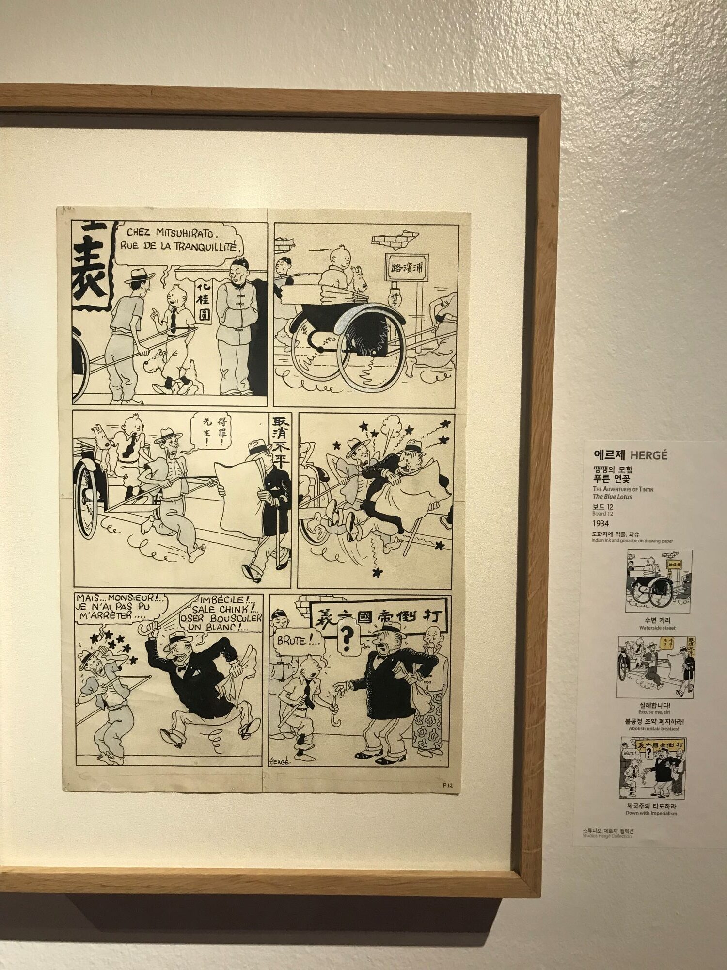
I had a lot of high hopes as we entered the next room. It was hard to miss with the absolutely gigantic print on the wall of the dragon from the cover of The Blue Lotus. However the room itself was a bit disappointing – especially for someone who count this album as an all-time favourite.
First of all, the room was sparse. Maybe there was an aesthetic reason to have such a large room left mostly empty except for the wooden ornate Chinese table and four chairs in the centre of the room, but I would’ve like to see it feature more… stuff!
Of course, there was some artwork in the room. Along the back wall there was a huge selection of covers of le petit vingtième. While they were very nice, they weren’t exactly specific to The Blue Lotus. There were some original pages from the album, but mostly they were highlighting the authenticity of the Chinese characters – all thanks to Hergé’s good friend Chang Chong-Chen. There was also some Chang’s artwork on display, and a photo of the pair… but The Blue Lotus is such a turning point in Hergé’s career and so important to the ideals that “The Adventures of Tintin” would later embrace (including an adherence to grounding the adventures in reality)… well, I just felt that there could have been a lot more to say about it. Oh, well.
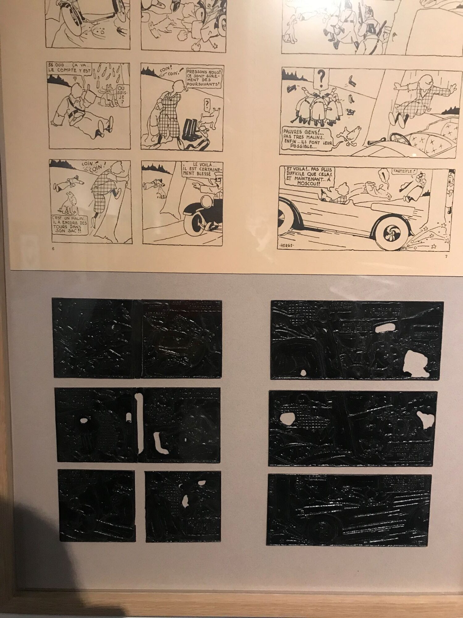
The next-to-last room was dedicated to Tintin in the Land of the Soviets – and featured a wall-sized image of Snowy running up a staircase. There was also an animated short, drawing from the original artwork, that showed the origins of Tintin’s famous quiff.
For me though, the artwork on display was what was really interesting. I may not be the biggest fan of Tintin in the Land of the Soviets, but seeing two of the pages printing plates was definitely something you don’t see everyday. To be honest, at first I wasn’t even sure what I was looking at, they’re mostly just black with slightly raised edges where the ink would get picked up and pressed.
According to online sources, the original plates were lost in the mid-1930s, which is why the book was not redrawn or colorized during Hergé’s lifetime like the other early albums. However, those same sources also say that the original zinc plates were rediscovered in the 1960s, allowing for the first officially sanctioned republication in 1969. It seems like over 80 original illustration plates from Tintin’s adventures are held at the Hergé Museum (Musée Hergé) in Louvain-la-Neuve, Belgium – and are often sent out on loan to the traveling exhibits, so these would appear to be two of them. Regardles… they were neat to see in person.
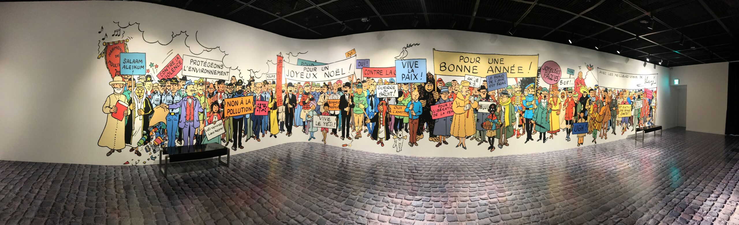
The final room of the exhibition is the obligatory photo-op. The entire huge wall was covered in artwork from the famous “frieze-style” seasonal greeting card that Hergé created in 1972, featuring over 100 characters from “The Adventures of Tintin” series. The wall was so large I had to break out the panorama function on my phone just to be able to get it all in. There were also a few cardboard cut-outs that you could hide behind to make it look like you were Tintin (among others).
The final stop on the tour was, of course, the gift shop. For the most part it was all the same items that you can find at any Tintin Shop, and the prices seemed to be on par. Since one of my passions is my 1/72 scale Tintin modeling project, I’m not usually all that interested in the consumer-ready items on offer. I also already have as much of a selection of Tintin figures as I feel I need, so there wasn’t really all that much I was interested in. The one thing that did catch my eye was the official Korean langauge edition of Tintin: Herge’s Masterpiece. Of course, since I already have that book in English… well I couldn’t really justify spending another 39,000 won on it.
Next to the gift shop there was also an activity centre for the kids… colour your own Tintin masterpiece! If you get bored of that… watch the Tintin animated adventures from the Nelvana television show! Lots of fun for the whole family!
As luck would have it though, I did find a stack of left-over copies on sale at the Tintin Shop in Seoul about a year later and couldn’t resist the blow-out low price of 19,000 won. I felt a bit guilty though, so I also bought a poster of Le Musée Imaginaire which now proudly hangs on the wall in my Tintin model workshop. Score!
If you want to get a sense of what it was like check out this video. It’s in Korean… but you’ll get the idea.
Discover more from strobez
Subscribe to get the latest posts sent to your email.